A celebration of style & stories of life

My first Women’s Day

Over the past year or so, feminism has been a hot word in many mouths. Thanks to Emily Wattson’s star struck media campaign encouraging men to support their fellow women counterparts in a fight for equality, and the slightly more under the radar Free the nipple movement challenging censorship in social media one boob at a time, or the more recent This girl can initiative wallpapering bus stops around London with bad-ass sporty girls, it is a damn good time to be a woman.

In my case, it’s my first International Women’s Day as a single mum. Not only that, but I am also a full-time working one, based in the city that saw the Suffragettes rise- and it feels pretty special.

I have always been quite passionate about women and their fight for equality. As a youngster at school, I remember feeling somehow frustrated whenever we would discuss Women’s Day and why we were celebrating it. It just wouldn’t make sense to me that girls would be treated any differently than boys- and still doesn’t. Surely, we shouldn’t need a day to remind ourselves of how strong and amazing women are – just as much as men-, but in reality we do.

Myself, just like the other 4m women in London, are living in the eye of probably yet another storm for women’s rights. And there have been so many.

geography / travel, Great Britain, women's movement, suffragettes, announcement of a demonstration at Essex Hall, London, 24.1.1

Campaigners on the streets of London, 1900’s.

And so many faces. Joan of Arch in the 1400’s, the Suffragettes and Suffragists in the early 20th Century, the fabricated yet just as powerful Rosie the Riveter in the SWW claiming ‘we could do it’ on posters all around the US, the shoulder-padded, power suited women across America and Europe in the eighties stomping their way into the professional workplace and now…. an Oscar winning Emily Watts? Or a crossed-out nipple stamped on a t-shirt?

463px-We_Can_Do_It!

 Second World War poster featuring ‘Rosie the Riveter’.

Whatever the next icon for girl power will be, there is still a lot to be done. So why not jump on board the pink wagon and support this fabulous day, every day but specially today!

Miley

Miley Cirus supports the Free the nipple initiative in New York

You can get involved online with #IWD2015, sport your #FreeTheNipple tee around your city, or even ask Emma Wattson a question at 5pm GMT on the official facebook page for the #HeForSHe campaign.

Happy Women’s day-


Introducing: Trommpo

COMPLEX PATTERN CONSTRUCTION, BOLD COLOUR WAYS AND NOBLE MATERIALS ARE SAWN 
TOGETHER TO SHAPE THIS NEW AND EXCITING CHILDREN'S WEAR BRAND.

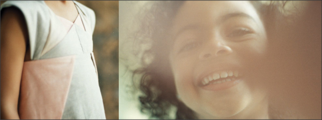
It is impossible not to pick up on how important creativity is for Trommpo. Any product you choose on their website -from any of their three all-time available collections- denotes a superior level of attention to detail. Every pleat and every seam is there for a reason. And as some baby food brands claim on their labels, there are most certainly ‘no nasty additives’ in this recipe. Any practical, Bauhaus-fan parent would be thrilled to know in Trommpo’s products shape pretty much always follows function.

Snap-2013-10-16-22-52-23

‘Popogami’ collection by Trommpo, 2013

TEM: Where does the inspiration and motivation to create clothing for kids come from?

T: Whilst living in London, where I studied a PG in fashion at Central Saint Martins, I was offered to design for a kids start-up company that was being created at the time –Jake & Maya. I accepted straight away, although I must say I was not very keen on the market sector at first. But as I started getting familiar with it, understanding the possibilities and discovering the other brands already out there, it fascinated me. Together with the owner, we designed the first 3 collections for the brand. Later in time, when my husband and I decided to move to Uruguay, we saw the opportunity to start Trommpo there, aiming to sell abroad.

Snap-2013-10-16-22-26-48

‘Moto’ collection by Trommpo, 2013


TEM: Why Uruguay? Having Catalina studied in London, and Dean being English, what made you choose the South American country?

T: We decided to move to Uruguay to be close to my family, and have a better quality of life in terms of living space and climate.

TEM: What impact has the birth of your first daughter, Cala, had in the brand?

T: It put everything into perspective. Less time meant we had to focus on the really important and so we let some things go – like the physical store in Montevideo. In terms of the product, we now design it even more functional, as everyday we are experiencing the needs of children’s wardrobes, first hand.

TEM: How is the creative process for each Collection? What is the one thing you cannot sit down to design without?

T: A theme or starting point. In the past we have taken inspiration from the Japanese tradition of Origami, planet Saturn, or the artist Popova. The collection we are working on at the moment for example, originated from one painting of the Uruguayan artist Barradas. Based on this initial inspirational source, we created the colour and shape palette to then move onto the pattern-making. This last step of the design process is a very strong point at Trommpo. Our patterns are elaborated and unconventional, and define each collection’s shape. Many of the main design decisions are made at this stage, too.

trommpo-origami dress

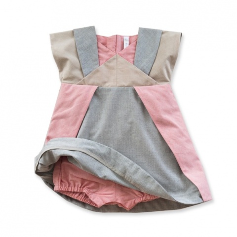
Origami dress by Trommpo

TEM: How would you describe the experience of working with your other half on the same project every day? Would you recommend it to other entrepreneurs -or just to your worst enemies?

T: Ha, ha. In our case the experience is very good. We complement each other’s personalities, and we blend together house and work. Trommpo’s duties are mixed with housekeeping duties like cooking or looking after Cala.

“There is always something to do at home, weather it is business or pleasure-related, we consider it all to be family work”

TEM: You have achieved a great exposure abroad, with selling points in the USA, Belgium and Corea. How has the penetration process been in such competitive markets? What asset is Trommpo’s main selling point?

It all started at Playtime – one of the most important fairs specialising in the children’s market, based in Paris. We showcased our products there, obtaining amazing feedback from buyers and interest from the media. Our products were later featured on Milk Collections magazine, and since then we have had several mentions and write-ups on some influential blogs. What buyers highlight from our product is the uniqueness of its design, together with the superior quality of the finishing and high level of attention to detail.

TEM: What would you say is the key to succeed in the international market?

Having a strong identity is fundamental. The product needs to differentiate itself from the one offered by your competitors, but still has to be relevant and current. Functionality is also paramount, and so is identifying the right price point for your product.

“If you manage to tick all these boxes, buyers will not mind that the product comes from far away – on the contrary, it will add the exotic factor to it.”

TEM: What is your personal favourite from Trommpo’s last collection –and why?

T: The ICE swimsuit from our Moto collection. It has everything we look for in our designs: it’s abstract, bold, with an interesting, intricate pattern work, and still remains appropriate for kids’s need of practicality.

trommpo- ice swimsuit

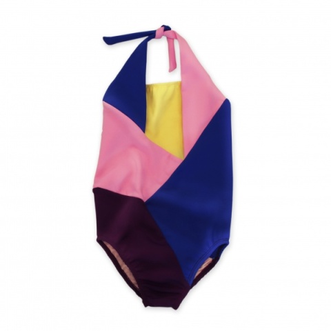
Ice swimsuit by Trommpo

Join Trommpo on facebook and follow them on twitter as @trommpo to get the latest news on the brand.

Designing with character

WITH THE CURIOSITY OF A YOUNGSTER, THE STYLE AWARENESS OF 
A TRAVELLING HABITUE, AND A PARTICULAR TASTE FOR ANYTHING UPBEAT, 
OLGA MAKES WITTY AND EVER SO SMILE-STEALING PIECES OF GRAPHIC DESIGN.

This design studio is the brainchild of graphic and product designer Lucia Picerno. It was born 2 years ago when she decided the time was right to have a studio of her own. Inspired by a three-month trip around Europe and having left her job at a publishing house, she thought it was time to “take the plunge and go for it”.

“At 26 I felt I had enough experience to try something on my own, enough drive to be able to make it happen, and enough ingenuity to believe I could conquer the world.”

olga-vacalactica

‘Vacalactica’ by Olga.

A STORY BEHIND A NAME

The name of the Studio is Lucia’s grandmother’s name. She was a very influential person who helped shaping Lucia’s character when growing up, so there was a strong emotional link to the four-lettered name. But as obvious as it may sound, the idea of using this familiar name did not occur to her straight away.  When in the search for a name to give life to her studio, Lucia had two conditions: it had to sound good no matter what language it was spoken in, and it had to be short. She came up with a pre-selection of perfectly suitable names but somehow none of them felt right. It wasn’t until she turned to her friends for advice that Eureka moment took place. A friend randomly asked her what her grandmother’s name was, and something clicked in her head -it made perfect sense-. Olga was born there and then.

olga-studio pic

Olga’s studio based in Montevideo, Uruguay.

THE BACKGROUND 

Olga’s inspiration springs from a place very close to home. Lucia’s great grandfather was a letterer and interior designer and she inherited all of his vintage type specimen catalogues. That influenced the young entrepreneur a great deal and was the foundation for her love of type. Lucia’s father is an antique dealer, so having grown up surrounded by antiques and typography, anything vintage or printed naturally moves her and constitutes her primary source of inspiration.

But her work is also very contemporary. Lucia composes her imagery using simple semiotic codes and a bright colour palette that produces refreshingly optimistic pieces, as appealing to adults as they are to kids. Like this, she balances her in-house grounding and more traditional formation, with keeping an open mind and a ‘sponge’ attitude towards life. As the designer explains it: “I try to absorb everything around me and store it for later use”.

olga-stickers6

‘Yogurt’, sticker by Olga.

ABOUT DESIGN IN URUGUAY

We asked Lucia about Uruguayan design. “Even though in Uruguay people tend to say we are 20 years behind on everything, I believe that due to the democratization of information the internet brought, we can now proudly declare to be up to date in terms of design. This is both in trends and technologies. Even though the Latin American country is one of the smallest, they have a rich history in art and there is a large community of artists and designers that shape a rich design scene that despite being new, is gradually shaping its own identity. “I think the key fact in Uruguayan design is the lack of resources, which could be seen as a drawback but I personally see it as an advantage. Lack of resources, commonly monetary resources, often results in more creativity.

“Sometimes restraints shape design better than infinite possibilities. We are used to such restraints so our work is creative no matter the circumstances.”

girls

‘Girls’ by Olga.

CAN WE PICK YOUR BRAIN?

The creative process always says a great deal about the designer and their way of thinking, and enlightens their problem-solving skills. We asked Lucia if we could have a cheeky peek into her mind at work, and this is what she told us.

“I always start with paper and pencil, sketching ideas is a must in my design process. I think with my pencil in hand, writing concepts down and exploring them in a playful way. In a more intellectual way I think passion is the key element in all I do. I love creating, I always say I am a maker at heart, whether its a painting, a piece of jewelry or a book cover,

I find the process of creating something out of nothing completely exhilarating. My work moves me and creativity defines me as a human being.”
olga-playbok

Lucia’s graduation portfolio

The young designer is currently working on a very special Project, a book inspired by the tales her dad used to tell her at bedtime. Its called “Las aventuras de la pulga narigona”(the adventures of the big nosed flea) and Lucia describes it as “a story about a flea that is born with such a big nose that she can’t jump, so a fairy gives her wings to fly. She travels the world and experiences things that without her “disability” she would have never had.”

WHAT THE FUTURE WILL BRING

Olga has just acquired a new associate, Kenia de los Campos. She is a very talented Graphics designer and photographer, so now as a duet, Olga has plans to grow, both inside and out of Uruguay. They have several exciting -though top secret- projects in line for the next few months, so keep an eye on them and follow their facebook profile, as we predict this female-fuelled studio is more than just a pretty name.

Fantasising about Majo Rey

Fernanda Montoro. The polariod photographer turned instagramer.

HAVING STUDIED FILMMAKING IN LONDON A FEW YEARS AGO AND LATER ON MOVING ONTO THE EXPLORATION OF ANALOGUE PHOTOGRAPHY, THIS ARTIST’S FOREVER-EVOLVING JOURNEY HAS FOUND A NEW, MORE COMMON MEDIUM.

OLD-SCHOOL TYPE OF GIRL

Fernanda’s favourite camera is the Polaroid sx70. The brand made this iconic piece in the 70’s and for the disappointment of many photographers it was rapidly discontinued in the early 80’s. Now standing as a rare and very sought-after camera by any vintage lover, this is the piece Fer considers to be ‘her precious’. “I love its design, the way it perfectly folds, how it captures light, and the whirring sound it makes when the picture is ejected”. Her most important partner in crime has the versatility of a chameleon and the trust-worthy reliability of any good old pal, as after 40 years of non-stop work it still works like a charm.

Fernanda-Montoro

Photography by Fernanda Montoro using Time Zero film 

This loyal friendship has also taught Fernanda a great deal about patience and taking it slow.  Just like with any analogue camera, “You naturally take longer to carefully compose the image and you don’t press the shooter until you are certain of its quality; you commit to it”.

Fernanda Montoro-flowers orange

Photography by Fernanda using 600 film

Fernanda Montoro kinnara

One of the series of pictures inspired by the Hindu goddess Kinnara.

FROM ANALOGY TO READY-TO-USE

With a number of followers climbing the 30,000, Fernanda Montoro’s series “Carspotting” is a classic amongst instagramers, and has been short-listed as one of the platform’s ‘suggested users’.

… I bet you wonder,  how can a traditionally-formed photographer who believes in the craftsmanship behind the art of photography, switch from analogue to this ready-made tool and be so comfortable with it?

“When Instagram became popular in 2011, many of my analogue photographer friends were not very happy to see the widespread proliferation of photos with filters resembling the vintage Poloroid look.  I personally thought that although Instagram could simulate the analogue aesthetic, that was just one of the many components of the analogue process.

 If you learn photography in the traditional way, you will understand how to compose, to handle light and to think before shooting, better than anyone else”

It is a personal journey. According to her, Instagram and Iphoneography are new means to communicate and share. She usually carries her Polaroid camera around with her, but there are times when she simply can’t. Most probably during those times if she hadn’t had her phone with her she would have missed moments worth capturing.

 “Instagram came into my life to fill a space, not to compete with my other photography”.

Her Instagram series entitled ‘Carspotting’ features classic cars, vans and motorcycles spotted by Fernanda around Montevideo and throughout the rest of Uruguay, in a very romantic and almost lyric way. These characters are part of the photographer’s admiration of vintage and those years of grandeur where timeless fashion was born. All her style icons also come from that era, naturally. He admires the timeless work of the French New Wave, such as Anna Karina, Jeanne Moreau, Jean Seberg or Brigitte Bardot. “It’s not really about what they wore but how, their mischievous and overall attitude will forever allow them to be in style”.

Fernanda Montoro-carspotting

#Carspotting series on Fernanda’s Instagram

MUSES & TALISMANS

Browsing through the Uruguayan’s instagram we notice the appearance of this cheerful, red-haired female character, which seems to act as Fernanda’s inspirational muse. Her name is Ana Paula Rondan, a very talented Uruguayan model who also happens to be a close friend of the photographer. Even if the term ‘muse’ may sound to you as an old-fashioned term out of an art encyclopaedia, it is very current for Montoro. When asked about the reasons behind this ongoing collaboration between the two of them, Montoro explained, “Ana Paula can really light up my imagination and creativity. She is a beautiful person, inside and out.”

 “When I photograph her everything flows, we connect in a very special way, we barely need to talk.”

Fernanda Montoro

Instagram shot featuring model and friend Ana Paula Rondan.

But Paula is not the photographer’s only lucky charm. She has a vintage light meter from the 40’s that is very unique and still does the trick. “Recently, while at a street photoshoot it was stolen from me and I was devastated. After several days of searching though, I managed to find it and get it back! I can’t imagine myself without it!”

COMMUTING IS A B*TCH

Fernanda has what could be called a very dynamic style of life. She juggles work and play between Montevideo and London, a venture that it’s getting harder every year.

 “When this crazy adventure started, I used to live the first 15 days of the month in one city and the last 15 in the other.”

Having both work projects and personal bonds in the two cities, she opted for this unconventional and physically exhausting way of life. But in 2011, after a couple of years of this plane-commuting routine, Fernanda started to gradually reduce the frequency of trips. Montevideo started to take over. Currently, she spends most of the year in the South American city, although she is still not ready to pick one yet. The photographer feels them both as home, “If only the two cities were closer…”.

Fernanda Montoro

 Instagram’s latest photograph by @fermontoro

Currently, Fernanda is working on one of her most exciting projects yet, as she  is adjusting the final details for a new venture linked to her popular instagram account. She will be sharing further information with all her followers soon, so if you are a fan, you most probably will be in for a treat.

Meet SABRINA TACH

WITH THE DRIVE OF A BORN AND BRED ENTREPRENEUR AND THE LAID-BACK ATTITUDE THAT OFTEN CHARACTERISES URUGUAYANS, SABRINA TACHJADIAN TALKS ABOUT THE HIGHS AND LOWS OF HER SOLO ADVENTURE AND CONFESSES HOW DESPITE BEING A BAG DESIGNER, SHE IS NOT A”  BAG FANATIC” HERSELF.


“Would you like some ‘mate’?” Sabri -as she refers to herself- kindly offers me a drink of the most popular Uruguayan drink as we sit down at her small folding kitchen table. It’s a sort of herbal tea that is brewed inside of this brownish, hollowed and dried fruit that is also referred to as ‘mate’. This is a sociable drink, you are meant to drink and pass it round, often performing as a great conversation starter. So her offering is a welcoming gesture.

Around us everything is quite minimal. Framed by white walls and wooden floors, Sabrina is wearing a little black dress teamed with glittery trainers, and her hair is casually loose. As I turn the recorder on, she’s looking outside her widely open double window, overlooking her neighbour’s leafy tropical garden.

It seems so obvious but I have to ask:

TEM: what is the most enjoyable aspect of your job?.

S: The freedom of it. I love being free to work from my own home, arrange my own schedules and do something that represents me. “I love what I do, but being free is what I love the most”. I had worked as an employee for many years, did random things like working at a chemist, and exciting things like being the fashion designer for an important local denim company, but I was now ready to start my own thing.

sabrina tach-new prods selectionMarte copper flatforms, Hip fanny pack and Feline sack by Sabrina Tach

TEM: Where did the inspiration for your product come from? S: I wanted to create something using the great-quality leather that we have available in Uruguay, and that could be easily exportable. “I am not a bag fanatic myself”, but it seemed like the ideal product to start with. My bags are carefully crafted in small amounts, by qualified workers who have been working the leather for many years. Even though the product doesn’t have a Uruguayan eastehtic, the production process is very Uruguayan.

As a small Southamerican country with a strong Italian and Spanish influence, we have our own pace. I know by name every single person who makes my bags, and they only produce 3 or 4 at a time.

TEM: Did you have any mentoring?

S: My dad used to own a children’s clothing boutique, so I have always been surrounded by fashion. Already as a kid, my dad used to take me along on his trips to buy samples, and I would try every piece of clothing on to check their fit. Fashion magazines have always been a normal read for me, so you could say that I was aware of all things fashionable from a young age.

sabrina tach-new collection! 2

Wonderland, new collection by Sabrina Tach 

TEM: How did your young products capture the attention of  the editors of such an influential publication as it is Vogue UK?

S: I received a call saying that they wanted to do a short write up featuring my products, and that was it. I have been ridicously lucky so far, honestly. I didn’t approach them and I probably shouldn’t say this, but I never did any marketing actions to contact any members of the press.

TEM: How do you then manage to get such good exposure in the international press?

S: It all started with etsy. I had a fan page on facebook where I would post my seasonal campaigns, but that only offered me local exposure. It was on etsy where I sold my first item aborad, and from then on the brand started to take off.  I have always been extremely careful when it cames to imaging. Seasonal campaigns are paramount to me. I work together with my friend and photographer Camila Gettar, designing every aspect of the shoot. We come up with a concept, we look for the right location and we make sure we get the pictures that we had in mind to make the accessories look the best. To me, that has been the reason why my product has succeeded -and why I now live of what I love-. My accessories were discovered from etsy by a few influential bloggers who liked the product, and who posted about them on their own blogs, quickly multiplying the brand’s exposure to hundreds and thousands of people who hapenned to be my target customers. I know this now, but It was never really planned. It all happened very organically.

TEM: Do you have an all times personal favourite?

S: ‘The Campus’ backpack. It has a sporty feel.

Campus Backpack

The Campus backpack by Sabrina Tach

Paint your village and you will paint the whole world

REPORTING BACK FROM THE LAND OF NAPPIES AND TEDDIES, AND INTRODUCING A NEW COLUMN ON DESIGN AND STYLE FROM ALL CORNERS OF THE WORLD.

To all my faithful readers and fellow blog comrades out there, hello! As you all know I took a break from the blog a few months ago to dedicate myself to being a new mum. This experience has been as amazing as time-consuming leaving the writer life a bit on the side for a while. But that while has come to an end, as I am now back! Back and stronger, packed with new ideas and exciting sections I will soon be revealing below.

This time-out gave me the chance to think about what I a m looking to get out of my career, and what I would like my contribution to the scene to be. Being a mother apart from being beyond magical in so many escalating levels is hard to put into words, it also throws you back to your roots. Almost like a re-load of yourself wisely programmed by nature, you ask what values you will teach your child and how you will do it. Discriminating what is important from what is not suddenly turns easy, and this gives you a new focus.

So I then came up with the theme of my first new column -and the final project for my MA in fashion and lifestyle journalism-. A series of articles that discover and promote great design, fashion and art start-ups from all the remote corners of the world. It’s an attempt to give these small-scaled projects a dynamic platform to communicate their ideas and speak to the world, right from their home towns.

“Paint your village and you will paint the whole world” by Leo Tolstoy, is a popular phrase that illustrates how if we do what we love and work from what we know best we will then be able to offer a unique identity that will stand-out and captivate the whole of the globalized world.

So for the first series of weekly articles I will be writing about the creative scene and the colourful personalities coming from Uruguay, a small country located in the East coast of South America, which also happens to be my beloved home town.

Uruguay Special

The Uruguay Special, new weekly section at The Evil Midget.

During the next six weeks to come , I will be presenting a new brand/artist each time for my ‘ URUGUAY SPECIAL’ new section. For the first piece -being published next Monday- I will be writing about Sabrina Tach, an exciting designer brand which is hitting the big names in the indie international scene with its fabulous leather bags.

Read this space.

Love,

VL

Paddling away, mermaid style

A NEW WAVY KIND OF SKINNY TROUSERS IS EMERGING FROM THE MERMAID-DRESS TREND. SO FAR, ONLY THE MOST STYLE-ADVENTUROUS HAVE GIVEN IT A GO. BUT BE PREPARED, AS WE FEEL THEY WILL BE THE NEXT BIG FASHION STROKE.

Mermaid dresses have been seen floating on the winter 12 catwalks of Givenchy and Burberry, sliding on the red carpet by the hand of Glen Close in her Zac Posen at The Oscars, and rocking at music festivals in rebellious bodies such as Jessie J’s in the last Brit Awards premier. Their magical cut creates its own sensual curves in the feminine body. These pieces are even able to transform little monsters into ladies, just like they did for Lady Gaga at the Mtv Emas last November, where she received a handful of awards in her gorgeously shiny, siren themed gown. The under the sea silhouette has never been so celebrity flattering.

But what about us, the common citizens of this planet Earth who are not invited to fancy parties? Well great news. There is a new, more casual way to get these seductive curves, and we call it the Mermaid Flares.


                                           First spotted on Susie Bubble, at LFW 2011, image by Topshop tumblr.

Featured in the up coming Vogue Festival website, image by Vogue.com.uk

As a more wearable option, one that can be comfortably worn during a busy day out in London, this new shape of trousers is an underground-friendly version of the siren gown.  Being skinny trousers from the hips to all the way down to the ankles, they should not go against our already established perception of what a pair of trousers should look like. Yet, it’s their surprising ending at the bottom which messes with our comfort zone. Like a blossoming tulip, a gentle flare appears to change the ending of the story. It covers the top of the shoes, creating the illusion of a longer leg that keeps on going until it touches the ground.

They were first seen on Susie Bubble -Stylebubble.co.uk- one of the edgiest young fashion pioneers, who chose them to attend LFW last September 2011. They were Topshop’s black “Flared Ponte trousers”, yet it was not the elegant name the one that captured the most curious’ attention, but the sexy trumpet shape at the bottom.

But great fashion ideas always come from above. From above the catwalk that is. House of Holland presented the ultimate mermaid trousers during this last London Fashion Week, in a laid-back, bright stripy version.

   House of Holland W/12 collection at LFW, image by Style.com

Their colleague designer, Willow, also jumped on board the trend as we were delighted by their gorgeously fitting suits composed of a knitted blazer and matching mermaid shaped flares.

      Willow, A/W 12 collection at LFW, image by Style.com

The siren mood also got to Italy, as Etro featured its own elegant version of the flares. These were patterned with oversized motifs and had a playful scalloped finish at the bottom that gently rested over the high-heeled shoes.

    Etro, A/W 12 collection at Milan FW, image by Style.com

Designers are giving us all the right signs. Just because it is not loud and in our faces, it doesn’t mean it is not there. This new fit is a gentle twist to something that took a while to get used to.

So if still in need of an extra dose of inspiration, we can always look back in history. These funky flares were first materialised by one of the most iconic fashion design duos in the 80’s, ‘Body Map’.

Body Map, 1980’s, image by Dazeddigital.com

Bright jersey leggings that made their own personal statement, away from the power gym wear of the time. A different choice from the hoodie-and-warmers look, these trousers were reserved for those who dared. So it’s been done. So it works. Just like they confronted the Flash Dance-fashion thirty years ago, our new mermaid flares are doing it again, but this time, the battle is against the skinnies. So why not get the wisdom from the elders’ and encourage ourselves to dive into this fresh mermaids’ adventure.

GET ORANGY WITH TANGERINE TANGO

PANTONE HAS NAMED THEIR 17-1463 TONE, ‘TANGERINE TANGO’, THE COLOUR OF THE YEAR 2012. AND -NOT SURPRISINGLY- THEY DO SEEM TO KNOW WHAT THEY ARE TALKING ABOUT, AS WE HAVE ALREADY SEEN IT POPING UP AGAIN AND AGAIN ALL OVER THE NEW EDITION OF THE NYFW.


                                                 1.                                    2.                                      3.

                                                 4.                                     5.                                6.

Images from style.com

Quite refreshing to the sight, this bold-bright, sparkling orange-tasting tone came as a splash of life to the American catwalk. Although still mainly dark, as it is the typical view for the ‘hiver’ seasons every year, those little sips of fresh orange juice were the perfect visual doses of vitamin C we will all be needing in order to overcome the incoming hibernating days.

Rodarte (1.) offered a collection as full of fantasy as flattering shapes and feminine soft textures, where doll- styled models with slightly messy rolled up hair do’s, walked along the catwalk featuring high ankle wedges and 3/4 lenght skirts and dresses. Orange was one of the accent colours chosen by the sisters Kate and Laura Mulleavy to give life to the otherwise dusty-blue, black and nude pallete collection. Overall, a collection that followed their already known and loved! highly artistic profile that elevates itself from most of the other down to earth catwalks, yet, managing to make it more wearable in this last attempt.

Justin Thornton and Thea Bregazzi for Preen (2) delighted us with what I consider to be my personal favourite at NYFW so far.  A refreshingly bold and bright collection that also followed the guidelines of the tangerine colour. More of a clean juxtaposition rather than a mixture, nature and the abstract were merged together to be the inspiration for this year’s brand’s proposal. Just like cutting and pasting, I could imagine each piece of garment being divided into different areas during the pattern making, that would be then filled with rather wild floral prints or plain color blocks. A vibrant colour palette that has nude as the main pillar, and leaf green, tango orange and black as the bright high-lighting brushes,  generates a strong feeling of freshness that just makes us forget what we are watching is actually, a winter collection.

Marc by Marc Jacobs (3) presented a mainly dark collection with black as the main colour and accents of electric blue, low profile- taupe and a slightly more red orange tone. With the simple style that characetrises the brand, hugging-warm, knee lenght skirts and coats were teamed with low rise military boots and hats, that together with 40ties’ inspired black frames gave the show a retro breeze, to create a modernly neat collection.

The amazing Vera Wang (4,5) winter 12 collection featured long sleeved, close to be body dresses and suits that presented  an empowering tailoring aesthetic. With the use of see through fabrics that make both, the tightening pattern cuts and the skin come to evidence, the suit formality was lowered down to a more delicate and feminine feel.

Karen Walker (6), with her more classic style, also adhered herself to the pantone declaration choosing the bright orange to highlight items of her mainly grey collection, together with an optimistic loud yellow that reassured the power of his cousin the orange.

This positive feeling colour is going to be all over the streets next season as it -with no doubts- projects the brighter side of our personality in a loud, expansive way. That is just the reason why monks wear it – apart from the fact it was the cheapest colour to use as dye back in the day- because it spreads the spirit, choosing it over and over again each day of their lives during centuries now. Such an up lifting and good-mood setter tone should be present in all our wardrobes next winter 12. I know I can’t wait until then, so might just start  earlier in spring to get in the spirit of things. What about you, fancy a splash of bold citrus in your life?

The Soft Diva

AT TIMES OF SOCIAL CRISIS WHEN THE NEWS IS FILLED WITH PESSIMISTIC UNEMPLOYMENT STATISTICS AND OUR SHOPPING LIST GETS SHORTER AND MORE BORING EACH MONTH IT’S THE CURVY IMAGE OF A TRADITIONAL CARING WOMAN THE ONE THAT IS STARRING OUR FANTASIES OF SECURITY

It has been a while since the feminine gender dressed itself up for success, gained equality with its masculine contestant at the work place and fairly divided the tedious house chores with the family man. Androgyny made the aesthetic walls between genres crash down, those that had been thoroughly built for centuries to separate roles, and melt to form one strong homogenic look. It has been a long race, and we could now say the image of the woman is a tougher one. So tough is powerful, and so powerful it can allow itself to be flexible. In these current turbulent days when the north hemisphere is facing a deep social crisis, heads are turning to a more trust-worthy and motherly shape of women as a way of reassurance. We call it the Soft Diva.

She is both strong and capable of embracing her more basic protective instincts at the same time as she plays with her irresistible curves through elegant moves.

References of this new type of woman can be found everywhere. We already saw the three Hollywood divas Marilyn Monroe, Marlene Dietrich and Rita Hayworth flood the screen with their magical glamour, at Dior’s last advertisement featuring its “Jadore” fragance.

Dior’s  TV commercial featuring their J’adore fragance, 2011. Video from Youtube.

The recent launch in December of the movie “My week with Marilyn” starred by Michelle Williams and based on the life of the golden age diva, brought back the sensuality of an icon that still today manages to capture the look of both men and women with her curvy hips and innocent smile.

Trailer of “My week with Marilyn”, 2011. Video from Youtube.

Madonna has just released her new video where she and Nicki Minaj explicitly play to be ‘The bombshell’ in a 50’s styled fantasy. The come back of this long time classy characters that represent the prosperity of good old times is suggesting an influence in style for the next seasons to come.

New video of Madonna’s song ” Give me all your lovin’ “, 2012. Video fron Youtube.

Nipping into the beauty field, hair adopts the vintage spirit for the next summer and winter 12 seasons as short and medium lengths are going to be seen with flappy up-dos or wavy loose classy styles. As spotted at the Jean Paul Gaultier spring 2012 ready to wear runway show, hair will be rolled and pulled up in order to get the 40ties elegant look.


                               Jean Paul Gaultier, S/S  RTW collection 2012 , Image from Style.com.

Peeking into the music industry, the business year 2011 closed with a revealing outcome after figures showed the British singer Adele, outsold Lady Gaga in the US. The performer some consider to be the next Madonna didn’t put up a fight as she sold a total of 2.1 million sales, almost a third of the 5.8 figure Adele achieved with her second album “21”.

Adele in cover of  ‘The Gentlewoman’, issue n 3.


           Lady Gaga, 2011, image from gossipcenter.com.           

This magical voice empowers a strong image. Not for being loud, wearing heavy eye make-up or rising controversy, but for its strong motherly, sweet figure that    enchants you with her singing just like a Greek goddess would. With a curvy line, sweet eyes and a classic beauty she sings from the soul. She is definitely one of the new divas, for whom warmness and sensuality are the key weapons of soft seduction. Almost like a mothers role she gives peace and protection with her cuddling hand movements as she performs.

It is all about feeling safe. And lady Gaga’s preaching is somehow different. It could be said she represents freedom and for some reason that is not what we seem to be needing. We have fought, we proved we could do it and are sure of our empowerment, and can now lay back and enjoy being what we are- whatever that may be- in our personal style. We will be embracing pearls, red lips and white curve-making dresses because that is what divas do, and divas is what we are.